
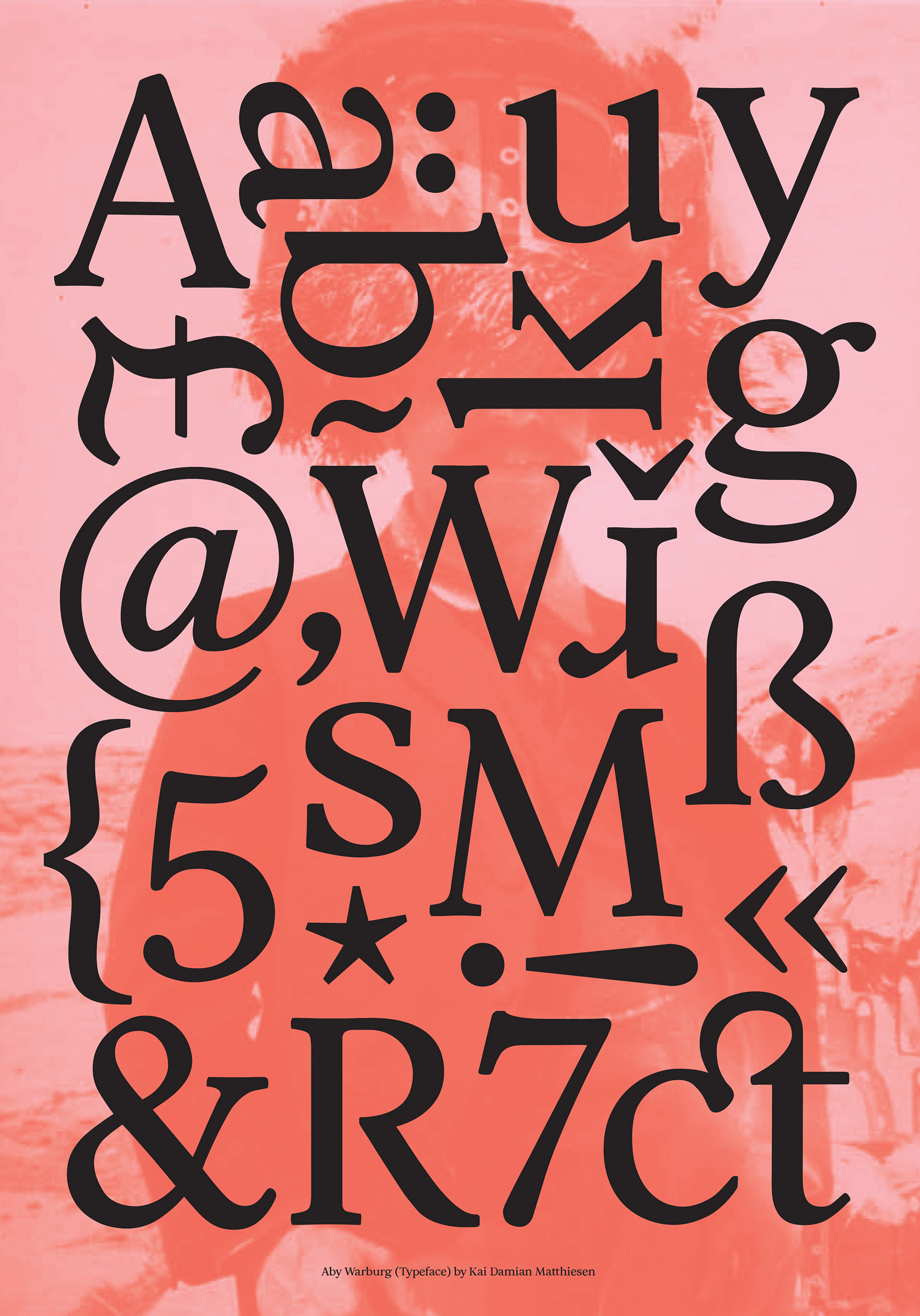
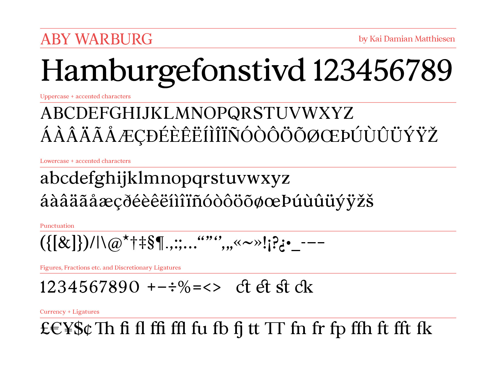
Type Specimen
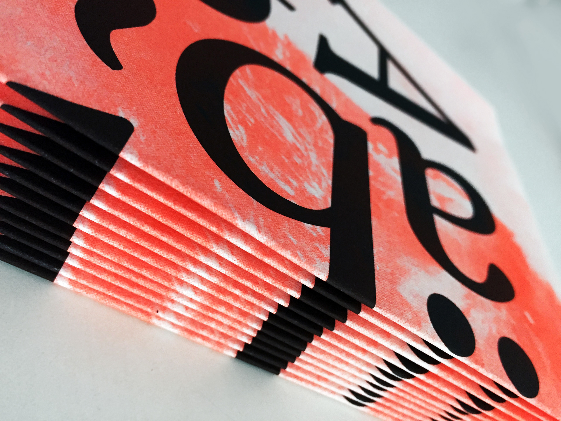
Risograph: Neon Red Printing & Offset Black
Get in touch for a copy: info@kai-matthiesen.com
Risograph: Neon Red Printing & Offset Black
Get in touch for a copy: info@kai-matthiesen.com
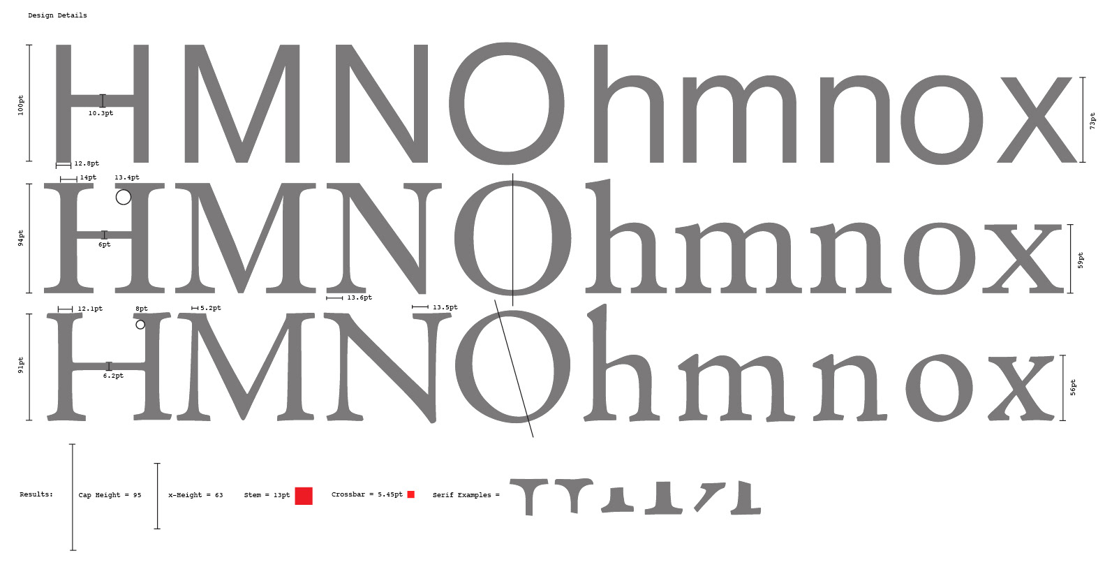
Process of drawing this font:
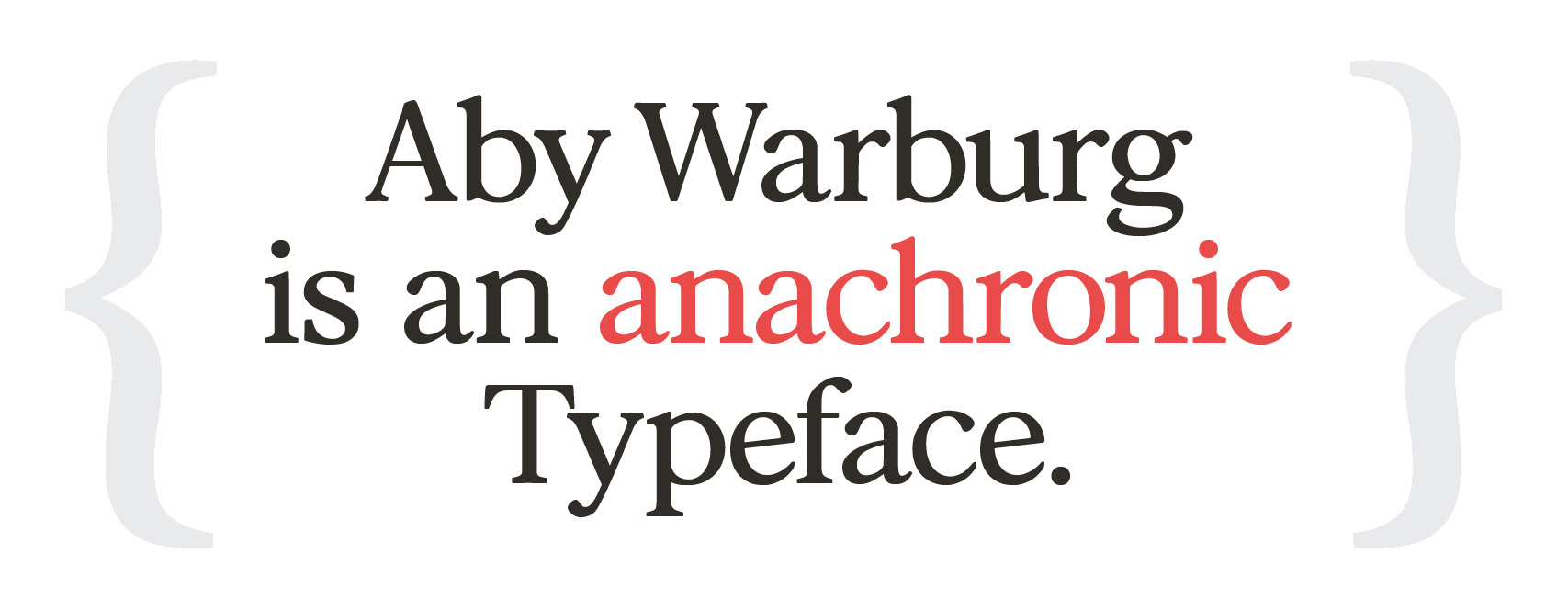
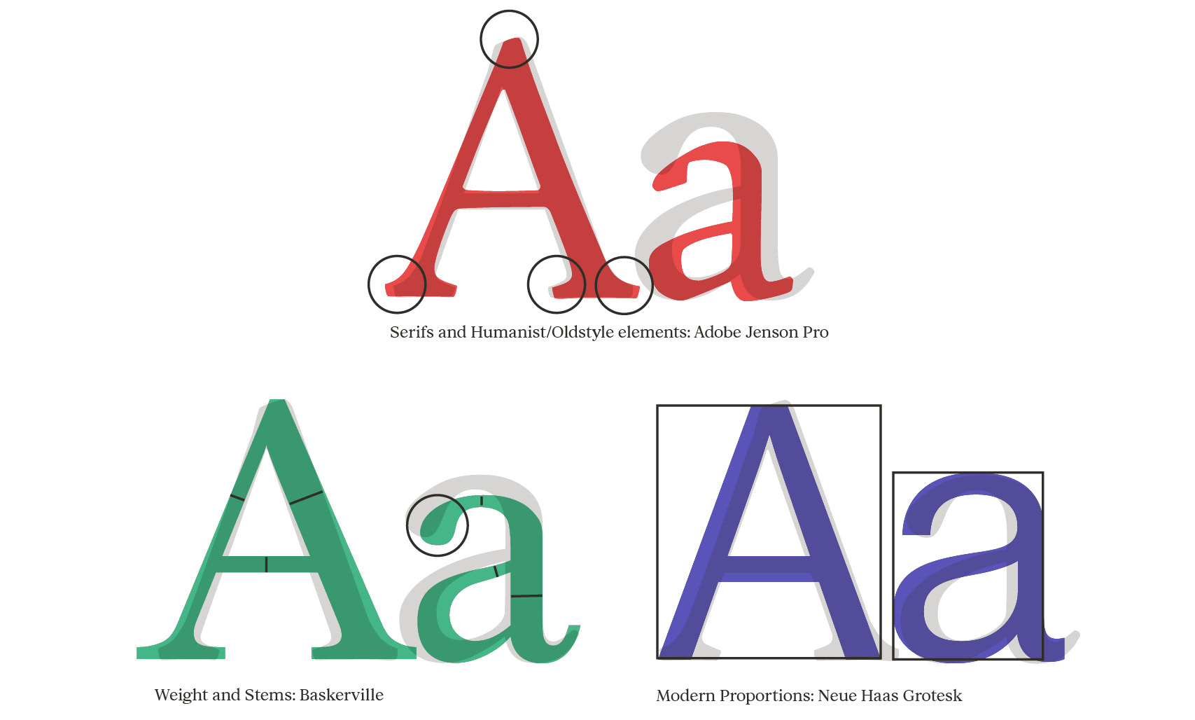
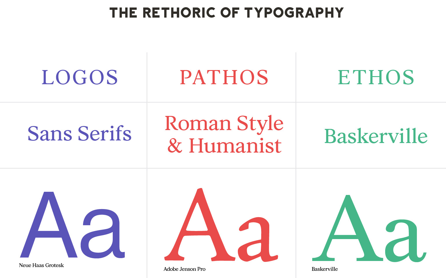
This project combines traditionally separate typographic traits from three typefaces that are representative of the factors: “Logos Pathos & Ethos”.
Research:
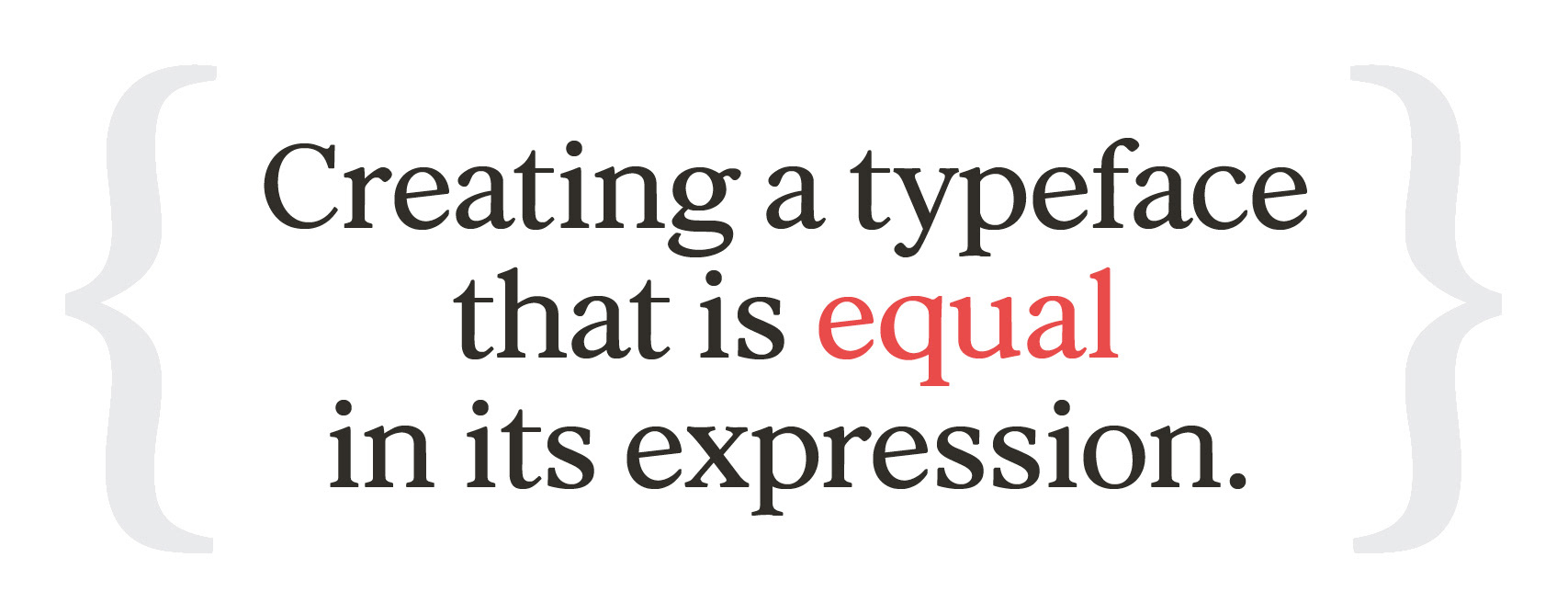
There is substantial evidence that type design has a great impact on the reader and that designers and non-designers perceive typography differently. Therefore I looked at existing psychological research that attempts to quantify the effect of typeface designs. I designed a typeface that is equal in its expression by combining traditionally separate categories of typography. “Sans-Serifs” for traits such as Consistency and Logic (Logos), “Humanist” for emotions, imagination (Pathos) and “Serifs” for credibility and trust (Ethos).
In Aristotle’s theory of Rhetoric: Logos, Pathos and Ethos are the key dimensions for speaking and communicating effectively. I think that also typefaces communicate and have a kind of rhetorical ability. Therefore I felt the need to investigate to what extent the reader can be influenced by typography. I looked through psychological studies to find three typefaces that can be representative of Logos, Pathos and Ethos and then took their unique qualities in order to design a typeface called Aby Warburg that would be equally unique in it’s persuasive character.


For more detailed information and research please go to the project: "The Rhetoric of Typography".